Modernizing Alberta.ca: A Case Study
EXECUTIVE SUMMARY
I led a comprehensive redesign of Alberta.ca, the Government of Alberta's primary digital gateway. This project involved a total overhaul of the site’s design, navigation, information architecture, and user experience across 7,000+ pages. By adopting a user-first philosophy, the redesign significantly improved the findability and accessibility of information for millions of Albertans.
CHALLENGE
Overcoming the "Information Swamp.” Despite hosting critical public information, the previous iterations of Alberta.ca suffered from structural legacy issues that hindered citizen engagement. Internal research identified several pain points:
Navigation Paralysis: Users felt swamped by information, often getting lost in deep taxonomies or losing their place when clicking global header elements.
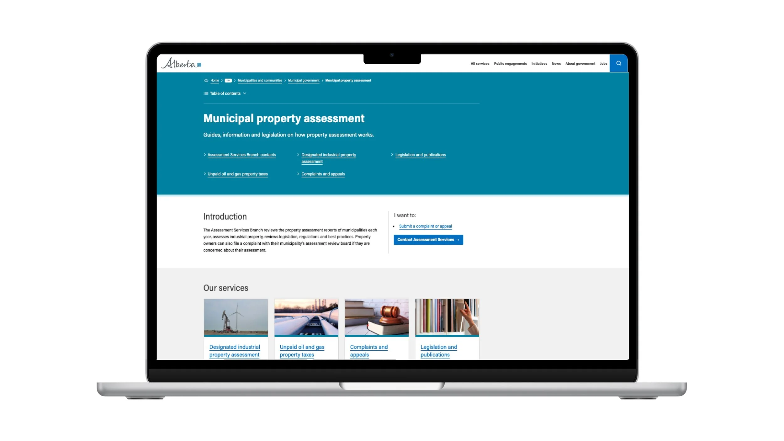
Band Blindness: Users regularly ignored critical information contained in branded blue and grey bands, perceiving them as non-clickable advertisements.
Discovery Gaps: A lack of lateral navigation meant users had to repeatedly click up and down through hierarchies to find related services, leading to frustration and low engagement.
STRATEGY
As the lead on this initiative, I prioritized a Research-First approach to ensure the new architecture was rooted in user behaviour rather than internal assumptions.
The Audit: Leveraged 140+ hours of usability testing and A/B testing with participants across North America.
The Philosophy: Focused on four pillars:
Safety — minimizing unintended actions,
Versatility — device-agnostic design,
Simplicity — knowledge-independent navigation,
Scanability — clear typography for reading and scanning content.
SOLUTION
The redesign, launched in March 2024, introduced several key structural innovations:
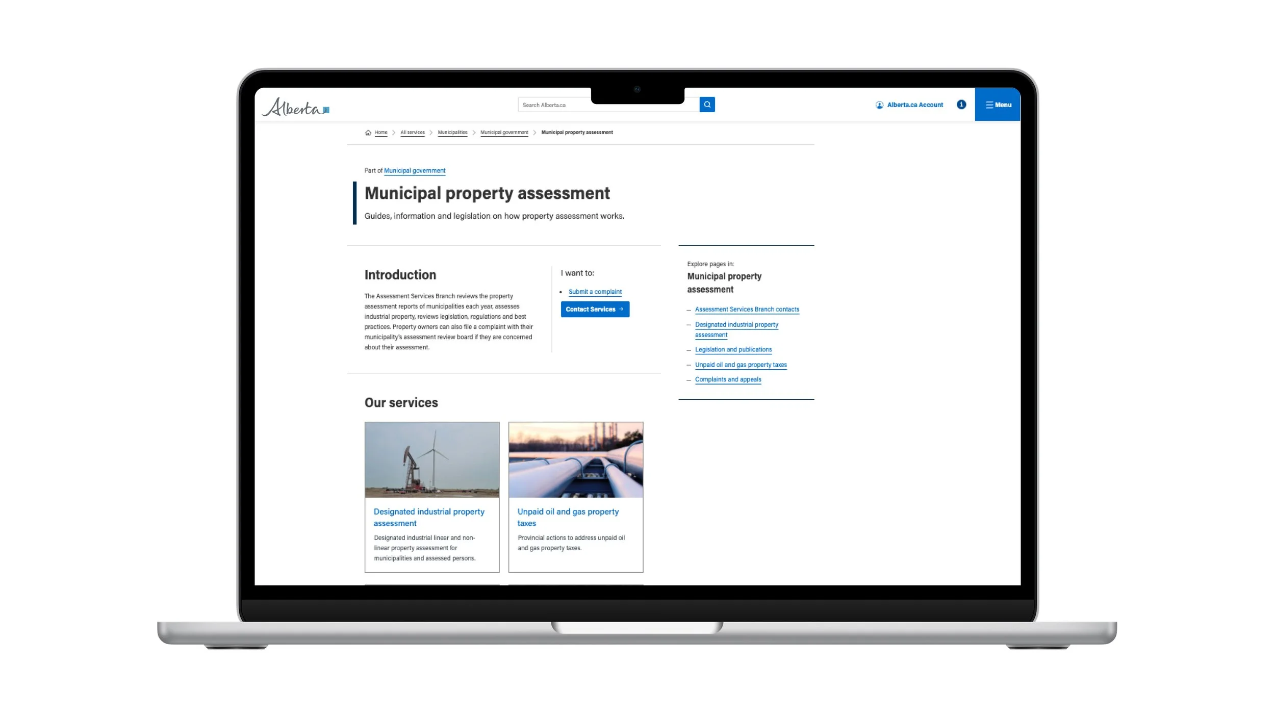
Streamlined Wayfinding: Expanded the search tool and replaced cluttered header links with a Hamburger Menu across the site. In addition, we expanded the Breadcrumb menu (both in the taxonomy and on the service pages) to provide a constant sense of place.
Eliminating Friction: Removed distracting colored bands in favour of clean white space and divider lines, significantly increasing the visibility of navigation elements.
Lateral Movement: Integrated a persistent Child Menu on the right-hand side (instead of hidden in a drop-down Table of Contents menu above the H1) and Previous / Next Buttons at the foot of pages, allowing users to move seamlessly through collections.
Standardized Accessible Grid: Replaced inconsistent, centred layouts — which caused eye-tracking fatigue — with a left-aligned grid that ensures a predictable reading path and consistent menu access from page to page.
Results & Impact
The redesign was met with overwhelmingly positive feedback from both users and internal stakeholders:
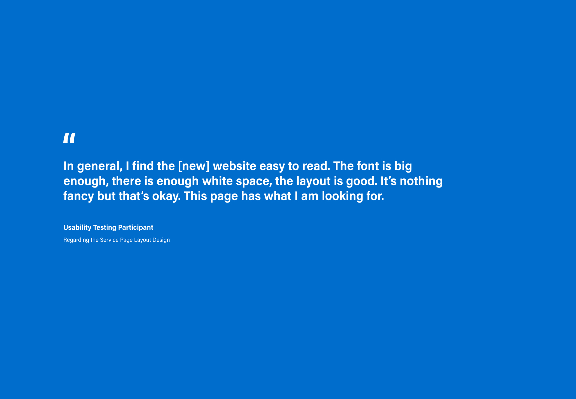
“On the old site, I felt like I was being swamped by information. The new feels very pinpointed and concise... it makes it easier to navigate to where you need to get to quickly.”
-
The new system outperformed the old design in all timed user tasks.
-
Users reported feeling "pinpointed" rather than "swamped," noting a significant reduction in cognitive load.
-
Increased readability through optimized font sizes, white space, and a mobile-responsive grid.
-
Successfully unified 7,000 pages under a single, cohesive design system that allows for greater content customization.
Leadership Takeaway
This project demonstrates my ability to lead large-scale digital transformations by balancing complex technical requirements with user-centric design. It highlights a commitment to transparency, accessibility, and data-backed communication strategies that ensure government services are not just available but truly accessible to every citizen.