CHALLENGE & STRATEGY:
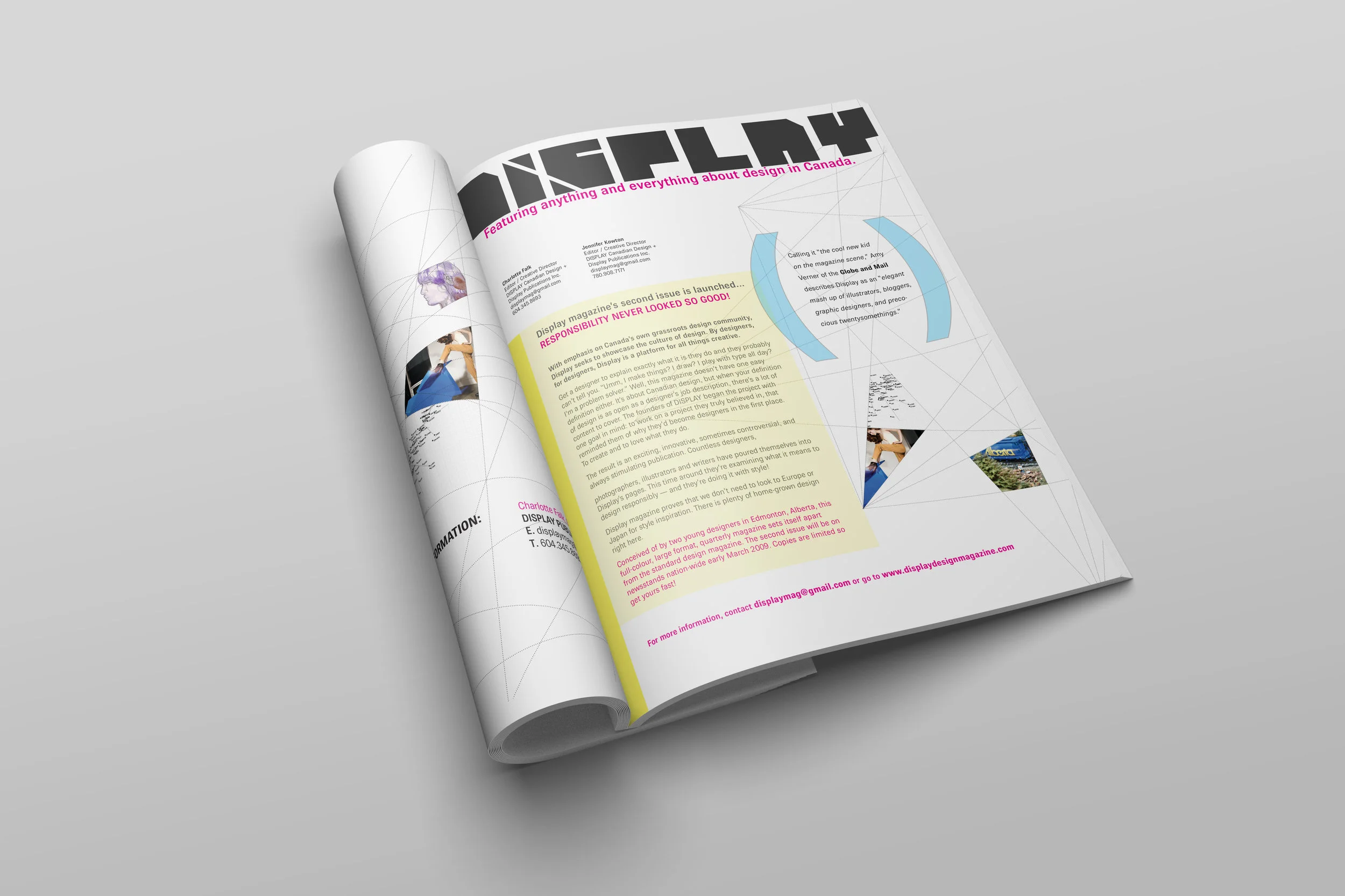
Recognizing a significant gap in the representation of emerging Canadian talent, I co-founded and launched a multi-platform media brand to serve as a primary catalyst for national design discourse. The strategy was to create a sophisticated, quarterly print publication supported by a high-cadence digital ecosystem. My goal was to move beyond traditional trade journalism to build an "intellectual and irreverent" brand identity that successfully unified disparate creative disciplines — from architecture to industrial design — under a single, cohesive national narrative.
IMPACT:
I successfully established a recognized national platform that elevated the profiles of hundreds of Canadian designers and redefined regional design representation. Over its five-year tenure, the publication grew into a multi-channel influence hub, demonstrating my ability to build a brand from inception to national prominence while maintaining a rigorous standard of creative excellence and editorial integrity.
LEADERSHIP & INNOVATION:
As Co-Publisher and Director (alongside Charlotte Falk), I spearheaded the end-to-end creative and operational lifecycle for over six years. I directed a diverse network of national contributors, managing everything from editorial curation and print production schedules to digital content strategy and community engagement. We innovated by blending high-design aesthetics with a "by-designers-for-designers" editorial philosophy, which earned national recognition from major outlets like The Globe and Mail for its role in galvanizing the Canadian creative community.
CHALLENGE & STRATEGY:
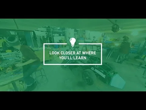
To fulfill the University’s Institutional Strategic Plan, I developed a video-first communication strategy designed to reach Gen Z where they are most active. Acknowledging research indicating that video is the preferred content medium for this demographic, I sought to bridge the gap between static print materials and dynamic digital storytelling. The strategy focused on creating a versatile library of video assets that could serve as both high-intent website content and high-impact visual anchors for in-person recruitment events across Canada.
IMPACT:
Successfully modernized the University’s recruitment toolkit, providing a powerful emotional layer to the existing communications mix. This series significantly enhanced the institution's "digital-first" reputation, resulting in a cohesive multi-channel presence that effectively increased engagement metrics on the recruitment website and provided recruiters with a premium visual asset for national events.
LEADERSHIP & INNOVATION:
I co-led the art direction and creative strategy, managing a production team of videographers and copywriters to translate complex recruitment goals into compelling visual narratives. By integrating user research and stakeholder consultations into the creative process, I ensured the content resonated with diverse student communities while maintaining institutional brand integrity. We innovated by creating a modular video suite that enabled consistent messaging across platforms, ensuring a seamless experience from a student’s first digital touchpoint to their final enrollment decision.
Additional Credits:
Videography: Jeanette Sessay & Jordon Hon
Copywriting: Jessica Murphy
CHALLENGE & STRATEGY:
To support the University’s out-of-province awareness campaign, I spearheaded a multi-phased digital strategy targeting a highly competitive national high-school demographic. Recognizing the high level of "ad fatigue" among Gen Z, I moved away from traditional academic sales pitches in favour of an engagement-driven approach. The strategy was to build long-term brand affinity by integrating the University into the students’ social feed through seasonal cultural touchpoints rather than transactional recruitment messaging.
IMPACT:
This campaign successfully shifted the recruitment narrative from "information-heavy" to "experience-focused," establishing a unique visual vernacular for the University that significantly cut through digital noise. This series served as a high-performing proof-of-concept for non-traditional marketing within the institution, directly contributing to increased brand recall and positive sentiment among prospective national students.
LEADERSHIP & INNOVATION:
I oversaw the creative lifecycle for five distinct campaign flights, directing animation and videography to produce high-engagement assets, including claymation, gamified content, and motion graphics. By championing "surprise and delight" as a core tactical requirement, I pushed the boundaries of traditional public-sector marketing. I managed the project from behind-the-scenes conceptualization to final deployment, ensuring all non-traditional media remained strictly aligned with the overarching institutional brand identity.
Gamification, video, and animation content can be viewed here; a behind-the-scenes look at the claymation project can be viewed here.
Additional Credits:
Illustration, Sculpture, & Art Direction: Jennifer Kowton
Animation: Susie Scott
Videography: Jordon Hon
Copywriting: Adam Gaumont & Jessica Murphy
CHALLENGE & STRATEGY:
As the lead creative strategist for the University’s primary recruitment tool, I was tasked with translating the Institutional Strategic Plan into a tangible brand experience for a discerning Gen Z audience. My objective was to move beyond traditional information delivery, creating a high-impact communications asset that balanced complex administrative "how-to" data with an emotive "why" narrative.
IMPACT:
The viewbook served as the cornerstone of the National Recruitment Strategy, successfully unifying disparate departmental messaging into one flagship piece that defined the University of Alberta brand for the 20XX recruitment cycle.
LEADERSHIP & INNOVATION:
Directing a multi-disciplinary team of photographers and copywriters to execute a "dual-entry" conceptual framework, the flip-book was conceived. Allowing for a non-linear user journey that respects the student’s specific stage in the decision-making funnel allowed us to maximize engagement across diverse demographics while maintaining a singular, cohesive institutional voice.
Additional Credits:
Photography: Jeanette Sesay & Conor McCracken
Copywriting: Jessica Murphy
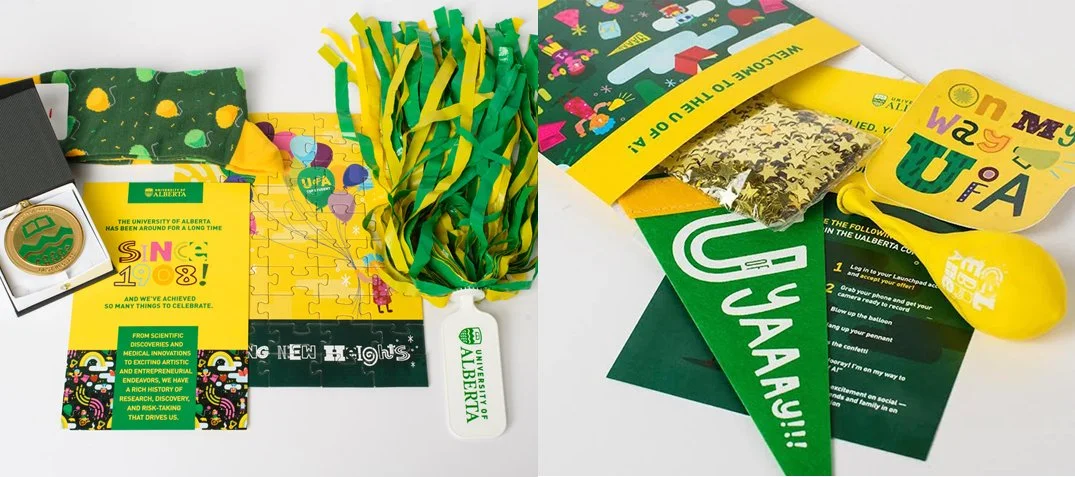
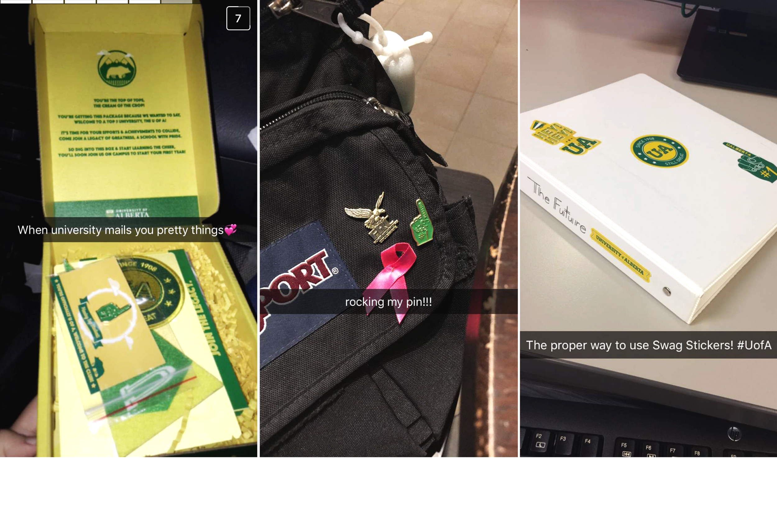
CHALLENGE & STRATEGY:
To convert high-achieving applicants into enrolled students, I led the strategy for the University’s flagship Yield Campaign — a high-touch direct-mail experience.
The challenge was twofold: first, to tap into the rite-of-passage psyche of our Gen Z audience, through a nostalgia-driven design system; and second, to successfully pivot the entire campaign the following year to align with the University's new "Leading With Purpose" brand architecture. My strategy focused on evolving the tactile swag box experience from a school-spirit-centric model to a purpose-driven narrative that placed the student at the center of the University’s mission.
IMPACT:
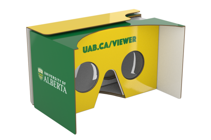
The Yield Campaign successfully delivered multi-year engagement, maintaining elevated conversion rates during a period of significant institutional brand change. By blending nostalgic aesthetics with emerging tech (VR) and then maturing that look into a student-centred model, I demonstrated the ability to scale and adapt a high-stakes communications project that aligns with changing brand standards and maintains stakeholder buy-in.
LEADERSHIP & INNOVATION:
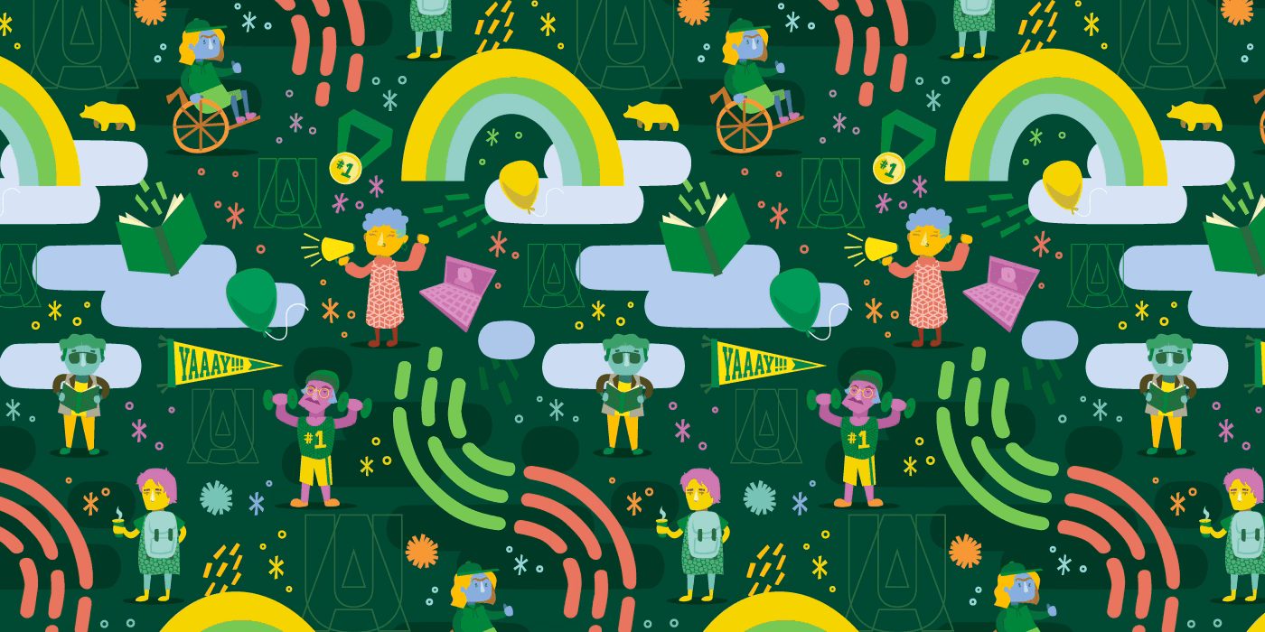
I spearheaded the transition between these two distinct brand phases, managing the creative shift without losing the campaign’s emotional resonance. In Year One, I introduced high-tech integration by directing a series of five 360-degree VR videos paired with branded Google Cardboard viewers. In Year Two, I oversaw the redevelopment of the visual language to incorporate new brand iconography and a student-in-situ illustration style. I acted as the bridge between the central branding office and the creative team, ensuring that "Leading With Purpose" was translated into a relatable visual story.
Additional Credits:
Production Design: Susie Scott
Videography: Jordon Hon
Copywriting: Jessica Murphy & Becky Mildon
CHALLENGE & STRATEGY:
Convocation is one of the University’s most significant annual engagements and requires a delicate balance of ceremonial tradition and modern student celebration. My strategy was to architect a two-part digital narrative: one focused on aspirational brand storytelling to open the ceremony, and the other focused on operational transparency to reduce student confusion leading up to the event. By addressing both the emotional and logistical needs of the graduating class, I aimed to ensure a seamless transition from student to alumnus while reinforcing the University's reputation for excellence.
IMPACT:
I successfully elevated the digital experience of the University’s largest event, resulting in a measurable decrease in student inquiries regarding ceremony logistics and a significant increase in positive sentiment during the live broadcast. These assets provided a scalable framework for future ceremonies, demonstrating my ability to manage high-visibility projects that protect and enhance institutional brand equity during critical public-facing moments.
LEADERSHIP & INNOVATION:
I directed the creative vision for a suite of high-stakes video assets, overseeing the production from conceptual storyboarding to final broadcast. I innovated by creating a "Know Before You Go" procedural video that utilized clear, high-production value to demystify complex ceremony logistics, effectively lowering the barrier to participation. For the ceremonial intro, I collaborated with senior institutional leadership to craft a message of resilience and achievement that reflected the unique cultural context of the graduating cohort, ensuring the University’s flagship event felt both personal and prestigious.
Additional Credits:
Videography: Jeanette Sessay & Jordon Hon
Copywriting: Jessica Murphy
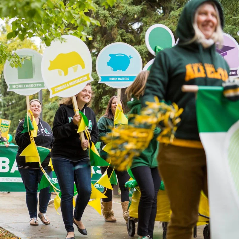
CHALLENGE & STRATEGY:
To support a major institutional shift toward a centralized service delivery model, I was tasked with reimagining the physical "Student Connect" environment. The challenge was to transform a high-traffic, multi-functional administrative space into an intuitive user journey for both current and prospective students. My strategy focused on applying UX principles to environmental branding, ensuring that the building's physical navigation mirrored the streamlined simplicity of the new under-one-roof service philosophy.
IMPACT:
Through the design and wayfinding, I successfully delivered a user-centric physical environment that significantly reduced navigation-related friction and administrative bottlenecks. This project resulted in a more accessible, less intimidating, and highly efficient service hub that aligned the physical campus experience with the University’s broader commitment to student success.
LEADERSHIP & INNOVATION:
I led the design and implementation of a comprehensive environmental wayfinding system. Utilizing data-driven insights and behavioural analysis from the previous service model, I identified critical pain points in the student journey. By collaborating with facilities and administrative stakeholders, I ensured the environmental branding served as a functional extension of the Student Connect identity, optimizing user flow through high-density service areas.
Additional Credits:
Illustration: Jennifer Kowton
Copywriting: Adam Gaumont
Posters are always a fun way to showcase your design-chops. They typically contain only a small amount of information necessary for the event and are a wide-open, blank canvas for creativity. As is the case with most designers, being asked to create a poster is one of my favourite requests. Here are a few of the ones I had a bit of fun designing for the Edmonton & District Labour Council, the Canadian Breast Cancer Foundation, Strategic Alliance for Alberta Students with Learning Challenges, the Law Enforcement Torch Run (for Special Olympics), and the University of Alberta.
CHALLENGE & STRATEGY:
To capture the critical "Back-to-School" retail window for West Edmonton Mall, I developed a dual-track communication strategy targeting both the high-school demographic and their primary household influencers (parents). The challenge was to create a high-impact direct mail campaign that felt authentic to a youth audience while maintaining the broad commercial appeal required for a major regional shopping destination. My strategy utilized a Self-Identification framework, designed to move beyond traditional retail catalogues and instead offer an immersive, narrative-driven experience that resonated with the student's personal identity.
IMPACT:
I successfully delivered a high-visibility seasonal campaign that drove significant foot traffic and brand engagement for Canada's largest shopping center. I demonstrated an ability to manage large-scale retail communications that deliver measurable commercial value while enhancing the mall's position as a cultural hub for the youth demographic.
LEADERSHIP & INNOVATION:
I spearheaded the creative conceptualization and execution of several high-volume ad-mail flights. I innovated by moving away from standard layouts in favour of conceptual storytelling; in one instance, I designed a "History Textbook" concept that visually integrated the student into the narrative. In another, I directed the production of large-format, fold-out posters that prioritized representational diversity, allowing students to see themselves reflected in the brand.